Client: Papermate
Agency: TBWA Kuala Lumpur
Country: Malaysia
Uploaded on 6 May, 2014
Source: Best Ads on TV, (2014). Right the wrong. [online] Available at: http://www.bestadsontv.com/ad/62464/Papermate-Liquid-Paper-Right-the-wrong [Accessed 27 May. 2014].
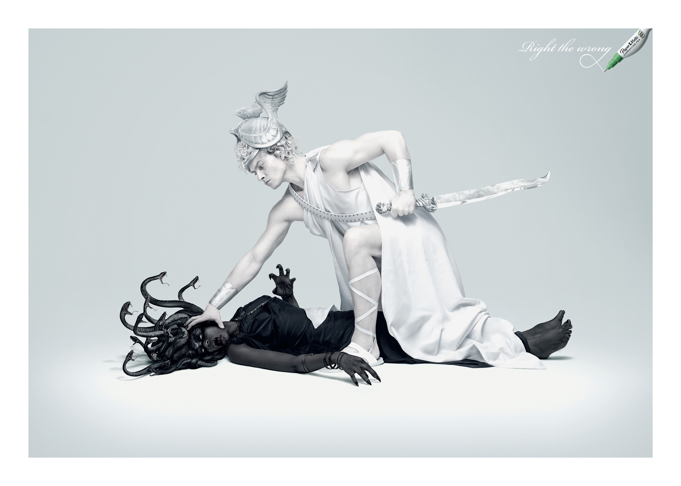
The selected print advertisement by Papermate carries the tagline: Right the Wrong. It shows a white Perseus holding on to Medusa's face, down on the ground - demonstrating that the white Perseus [angel] have overpowered and conquered Medusa [evil].
The advertisement takes on a dramatic stance when it comes to its correction pen, depicting it as a powerful force of good that can destroy the face of evil. In this situation, typos are a form of evil to many people, especially for those who have a stickler for grammar. (Young, M.)
The advertisement is being portrayed like a stage performance, with spotlight shining from above to focus on the main subject [the Perseus & Medusa]. Adding on, the direction of the Perseus's hand is on Medusa's face, creating a sense of movement which helps direct the viewer's eye to the palm on Medusa's face. The reason why it was portrayed in this way is to suit the depiction, "destroy the face of evil".
As for the colours used, it is mainly white and black. The colour white, represents purity and protection. Whereas the colour black, represents fear and evil. By using this two colours, it perfectly matches the style and subject used in this print advertisement.
Conclusion:
In my opinion, I think that this Papermate advertisement was cleverly done, with great art direction where the product was personified as the Perseus [angel] and our mistakes/correction as the legendary scenes of the devil, Medusa. The print advertisement have successfully enhancing the message and gave it impact to the viewers/audiences.
Source/Referecing:
Young, M. (2014). The Papermate Liquid Paper Campaign Urges People to 'Right the Wrong'. Available: http://www.trendhunter.com/trends/papermate-liquid-paper. Last accessed 27th May 2014.
Wright, A. (2008). Psychological Properties Of Colours. Available: http://www.colour-affects.co.uk/psychological-properties-of-colours. Last accessed 27th May 2014.
 RSS Feed